Wednesday, September 25, 2013

Medicine Cabinet Makeover

We're beginning a complete overhaul of our upstairs bathroom. We're starting with a treatment on the walls and paint, but will eventually replace all of the plumping, tile, electrical, everything.
 
 
So until we are ready to do the major items, we're starting small. In this case, with a little makeover of our medicine cabinet.
 
 
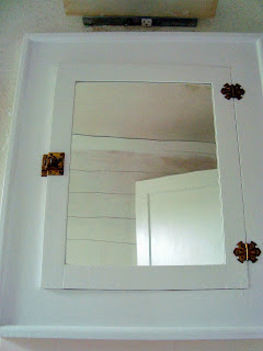
Before we did anything, it was grungy and off white and we had never taken the time to organize the inside of it so there were all sorts of random objects just thrown in there. And it's not pictured, but the hardware on the outside was caked with multiple layers of paint.

 
So we painted her white on the outside for a fresh, clean look...

 
And stripped the hardware of paint using the same method I talked about here. Except for this time we left it brass...not quite sure what I have been thinking spray painting this stuff. Actually, I do know. I was reading too much Young House Love. I'm over the oil rubbed bronze look, much more into the antique brass trend right now. And, less work for me since I don't have to spray paint the hardware. Win win.

 
The inside is the really fun part of this makeover. We painted the shelves white, but went for a vibrant green on the beadboard. And used chalkboard paint on the inside of the door. I hope we really use the chalkboard to write each other little encouraging notes for the day and what not. I hope. Lists of things we need in the bathroom are acceptable, too.

 
Stuart was very excited for this project to be finished and for our mirror to be hung again. The mirror was off being sanded and painted for longer than I care to admit, so this was the first note I left him :).

 
And now all of our tiny bathroom goods are stored in this cabinet. I hunted our house for tiny containers to corral everything in.

 
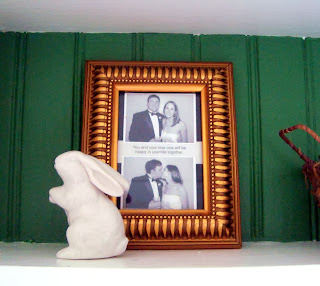
And even had enough room leftover to sneak a small frame in there. The pictures are from a photo strip at someone's wedding and between them is the first fortune we opened after we were married. It says "You and your loved one will be happy in your life together". I'll take it.

 
Can't have a chalkboard door without chalk, and a place to store it!

 
And for items like cotton balls, Qtips, and those little floss doodads (side note: does anyone out there actually use these?? They are tiny little torture devices in my opinion...) I used some mason jars I had around the house and spray painted the lids gold.  
 
 
So that's our medicine cabinet makeover...much better, no?


But ohemgee look at the rest of that wall of the bathroom! Much work to do...
 
 
And I couldn't end this post without a picture of what inspired our green in the cabinet. I ordered this little 3-tiered stand from One Kings Lane about a year ago and love it. It holds toilet paper and tea towels on top, washcloths in middle, and towels on bottom.
 
 
And here's a sneak peak of the "wall treatment" I mentioned that we're working on...planks! We are planking all the walls, but are waiting to do the one with the medicine cabinet since we first need to open her up for new plumbing and electric.
 
Soon, I hope.


Tuesday, June 25, 2013

Inspiration

My inspiration for our home comes in waves, and I've had a bit of a dry spell for the past few months. Sorry for the silence. Moving forward I'm going to try to simplify things on the blog with a simpler design and with more frequent, but shorter, posts. Sound good?
We've been working on a few projects around the house, but sometimes I get bogged down and frustrated by the snail's pace at which we seem to move.


And boom, just like that I buy an orchid and all of a sudden I feel inspired again. May sound silly, but sometimes it's the little things like that that motivate me to clean my room just so I can see how things like the orchid look when the room is at its best.

Before (which was always just temporary):


I pinned the image below on Pinterest and shopped around the house + bought my orchid to see what I could come up with for the dresser in our bedroom.

{source?}


I paired a sweet little lamp we got for our wedding on top of some North Carolina books that my boss gave me.


Leaning against the lamp I framed this tiny picture of our house that the original owners left behind for us. I love the picture in the forefront paired with the painting of our home hanging over the dresser.


Orchid!


What's inspiring you lately?


Monday, January 28, 2013

"Us" Before We Knew It

If you follow our blog fairly regularly, I think it's safe to assume that you have at least a slight interest in old homes. Or maybe crafty projects. Or maybe you're just nosy and like to see what we're up to--all of which are perfectly acceptable reasons to follow us :) The post I'm sharing today touches on the first reason you may be a follower--an interest in the old.
 
 
The venue we had our wedding reception at is just that--old, just like our home. And I thought it was high time we shared it here because it is a wonderful example of how the adaptive use of older homes and buildings can be transformed to historically preserve old spaces while reclaiming them to accommodate modern needs and function.

 
Our wedding was in Columbia, SC and our reception was at a historic building called 701 Whaley. 701 (as it's called for short) was built in 1903 and served as a community center in the neighborhood for many years. Until it was condemned. You heard right. In the mid 2000s some business partners bought the property and began to restore it.
 
 
Today the building serves as a rental property for weddings, has loft spaces, an art studio and exhibits, and houses several small businesses.
 
 
To me, the most wonderful part about 701 is that the new owners tried to leave as many original details as they could intact.
 
 
One of the owners told me that several times he actually had to have serious chats with the subcontractors because they kept trying to smooth over the walls and patch holes.
 
 
How much character would this wall have lost if they had gone through with patchwork?
 
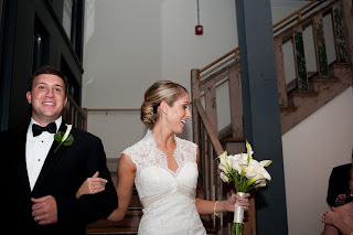
And here is the original staircase that descends into the space--this is how we made our entrance into the reception :) 

 
Exposed ceilings, swoon--even the duct work becomes a piece of industrial-ish art in this space.
 
 
And have you ever seen a more beautiful elevator floor?! That basket weave tile work--love.

 
Even the bathrooms are amazing! Love the combination of the marble tiled walls with basket weave floor tiling.
 
 
This venue was so "us", before we really even knew what "us" (in terms of design) was.
 
So tell me, because now I'm kind of wondering--why do you read our blog?!
 
This post is part of the series:
 
 
To read other posts in this series click on the January 2013 links under 'Blog Archive' in the right hand column.


Finishing Touches

If you're new to the blog or just now catching up with mountain house posts you may want to start here, here, here, here, here, and here before continuing below...

The last trip we made up to the mountain house before it was complete was in early December 2011. When we pulled up to the house, the exterior was nearly finished.


We had a front door (!), all of the windows were in, the stain was on, exterior lighting had been added, and all the contractor had left to do was add the front stairs, add a ramp (on the right side, where you see part of the railing missing), and stain the window eaves.


The kitchen was also nearly complete, which was huge progress from our last visit where only a few of the cabinets had been assembled. We selected stainless steel appliances at a nearby Sears outlet, and went with the year prior models to save some dough. We decided on tile counter tops, since granite was more expensive than any of us wanted to pay (especially since this is a vacation home and not any of our permanent homes) and we didn't feel good about laminate because we thought we would end up having to replace it down the road.


The light in the eating area right off of the kitchen had been installed, and was just begging for a table to be put under it so no one would bang a head anymore!


The counter tops, cabinet doors, and cabinet hardware had been installed in the master bathroom. All that was needed in here at this point were tile floors, light fixtures, and a mirror over the double sinks.


Our toilets were also in place this visit--yay for plumbing! We went with the toilets that are taller than average, because we all expect to have this house until we are old and gray (we've made a family pact that we won't sell the house, like, ever) and were trying to think ahead to those years where it may not be as easy to get up and down! At this point, this 1/2 bath was just waiting for its pedestal sink & mirror to be installed.


All of the light fixtures had been installed by the front door, doors were put on the laundry room and 1/2 bath, and there was a railing for the stairwell!


As we left from this visit, it was with much anticipation for our next return and a completed mountain house!

This post is part of the series:


To read other posts in this series click on the January 2013 links under 'Blog Archive' in the right hand column.


Sunday, January 27, 2013

Road Trippin'

If you're new to the blog or just now catching up with mountain house posts you may want to start here, here, here, here, and here before continuing below...

Back to the mountain house, where else? Last we left off on this new-home-building journey of ours the floors were being installed and the exterior of the home had been stained. Our next visit to the house in November 2011 revealed, as had come to be expected at this point, much progress.


The flat stone on the fireplace was nearly complete and was looking just as we had envisioned.


The crew just had this little bit left to do at the top and then the stonework would be complete and ready for a mantel.


The kitchen cabinets were beginning to be assembled. We had a cabinet maker in Morganton (Mr. Mull's hometown, about 45 minutes away from the mountain house) make all of the cabinetry throughout the home and it turned out so beautiful.


And all of the walls were painted! There aren't too many walls to paint, since the exterior logs are exposed inside as well as out, but for the walls that we did need to paint we chose this sage green (above), a burnt red, and a cream. All of the common rooms are the sage green, the full bathrooms and laundry room are burnt red, and the bedrooms + half bath are cream.


The  master bathroom cabinets were also beginning to be installed on this visit. No counter top or doors yet, but significant progress nonetheless!


And here is a peak at the burnt red color--I love all of the colors that we chose! I think they're very mountain-esque (because that's a word).


The bedrooms were coated with a nice, neutral cream and all of the baseboards were hung.


The doors had also been installed--we love the doors we chose which mimic the tongue and groove ceilings in the great room and loft areas.


Another exciting addition this trip were the exterior balconies off of the two upstairs bedrooms. You can't tell from this picture, but the threshold of each door is higher than average to prevent snow from coming inside!


The tongue and groove ceilings in the great room and loft were finished off with trim and molding...


and those top two windows in the great room were finally installed!


With winter fast approaching (construction pretty much shuts down in Blowing Rock in the winter due to the frequent extreme weather conditions), we were eager for the home to be complete. Luckily, our contractor was working hard to finish in time and get us in before Christmas!

This post is part of the series:


To read other posts in this series click on the January 2013 links under 'Blog Archive' in the right hand column.